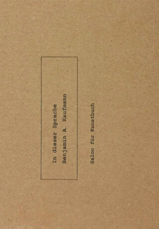
Soft Cover, German / English, Glue Binding, 120 Pages, 2020, Salon für Kunstbuch
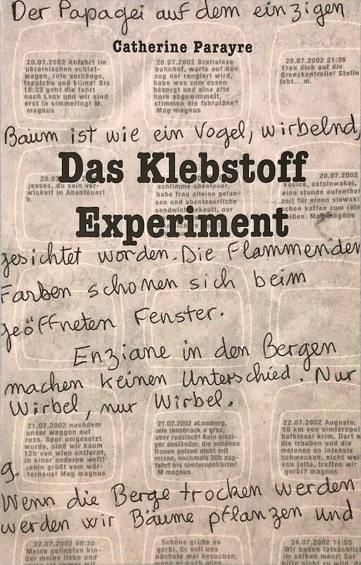
Das Klebstoff Experiment
The glue experiment. Located in a small town approximately twenty kilometers north of Vienna,
Atelier Gugging is an open studio based on the creative experience of the Gugging House for Artists, whose residents are important representatives of Art Brut. In the Atelier, these artists work in a friendly atmosphere side by side with guests from Austria and abroad.
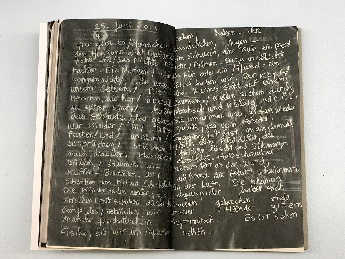
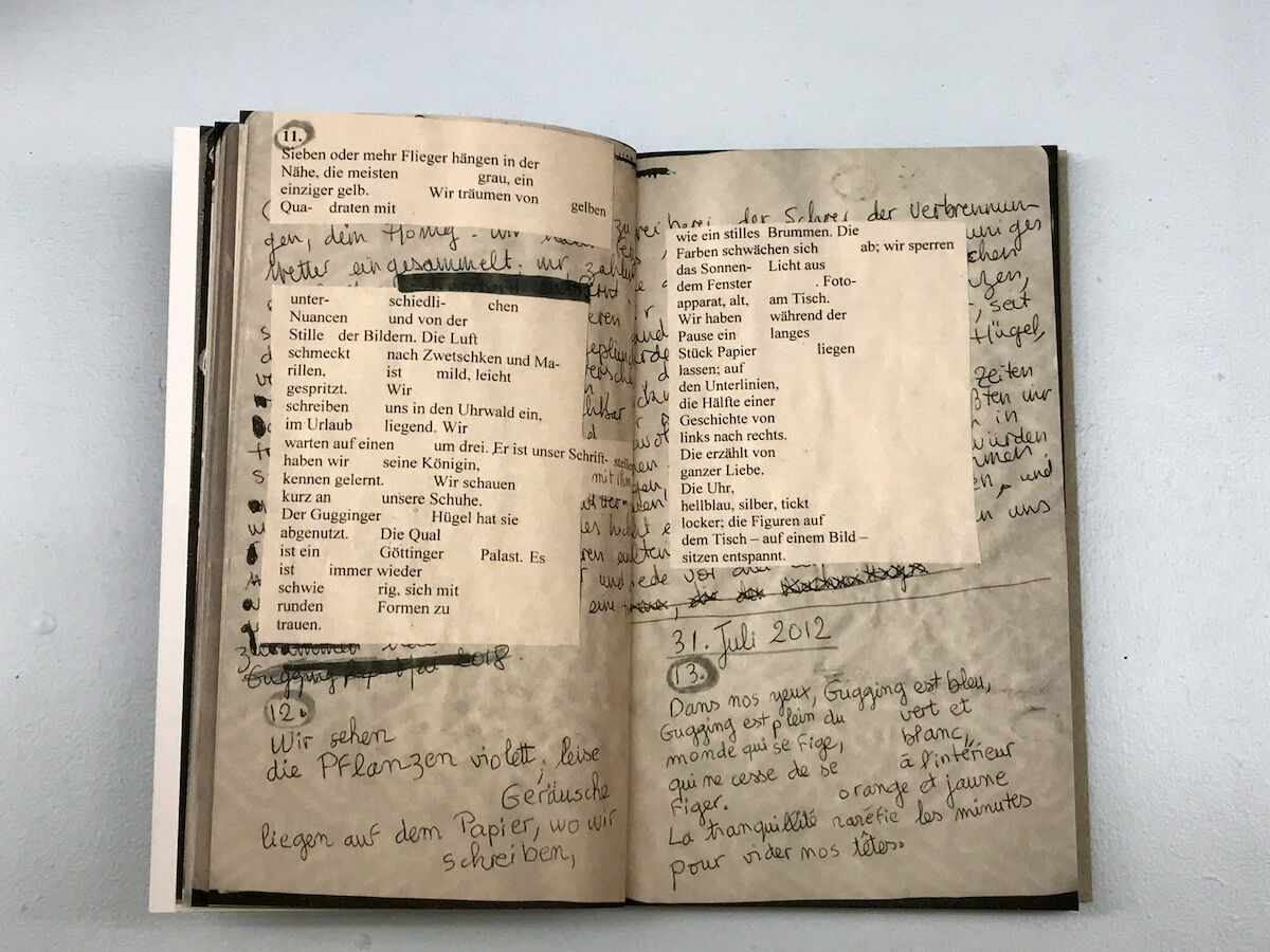
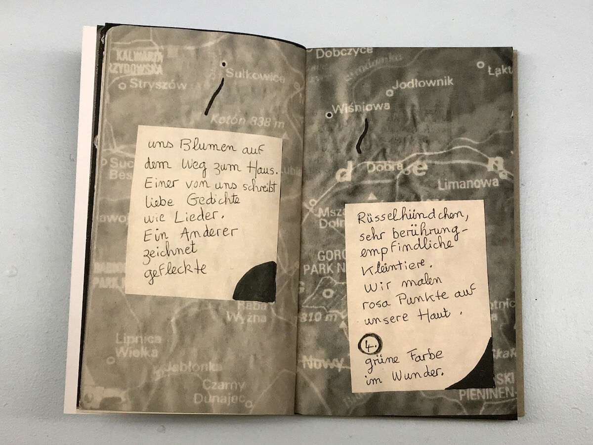
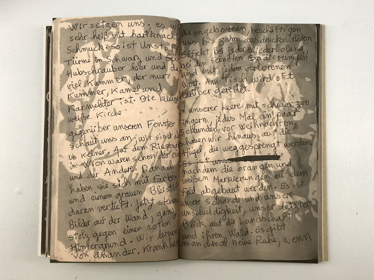
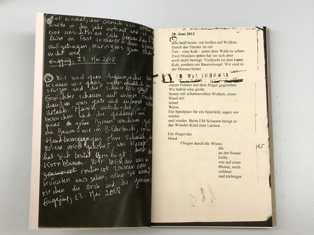
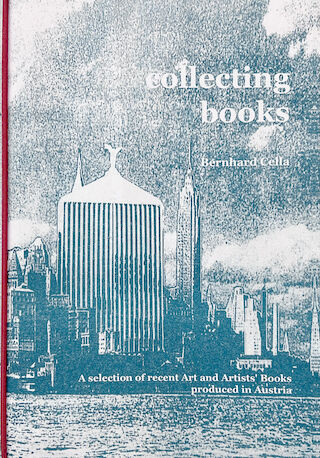
From 2012 to 2018, Catherine Parayre travelled each Spring from Canada to Austria to visit Gugging. She spent each day in the Atelier to write down her perceptions of this stimulating environment. Her entries constitute a deeply subjective diary yet refrain from any (auto)biographical elements. The texts are about time and place, not about an individual. Im Atelier, Dokumentation 2012-2018: Gugging. The texts were then copied or glued on a pale-blue travel journal by Bernhard Cella, published in 2003.
In praise of the artists book:
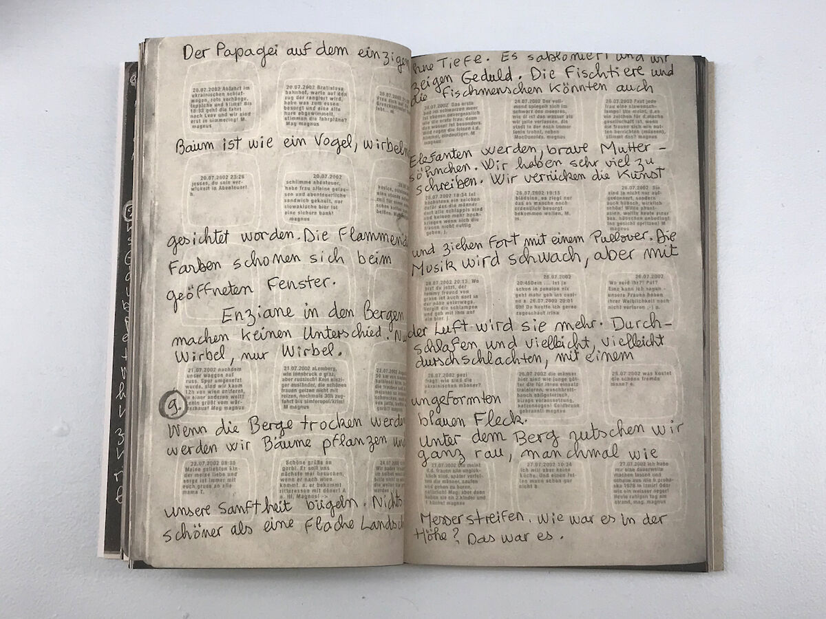
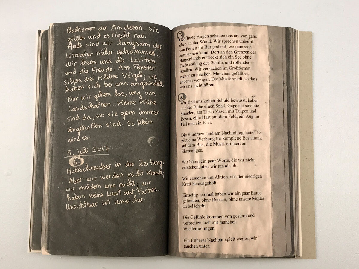
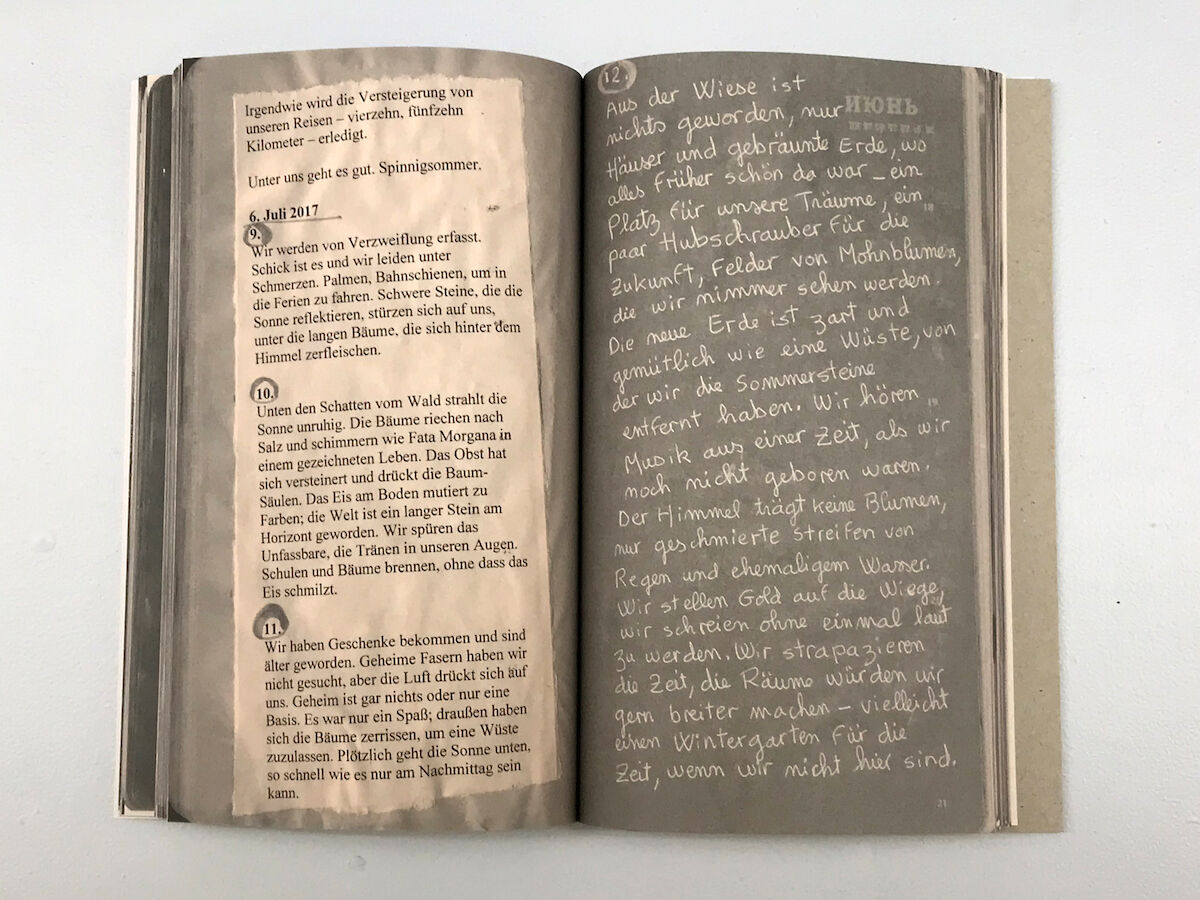
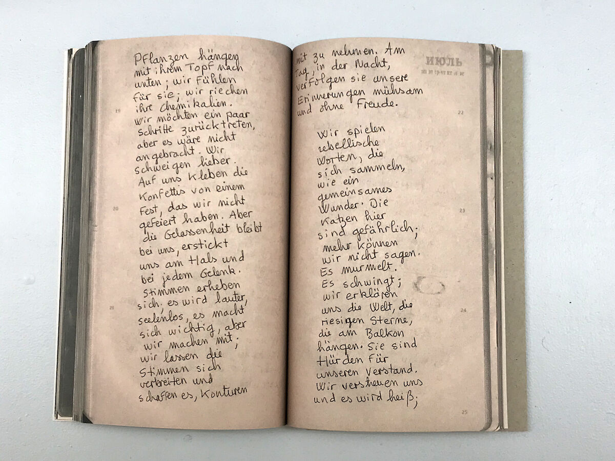
Small enough to pick it up from the shelf or the table, it sits naturally in the cup of both hands and whether by chance or by design, it falls open to pages 11 and 12. I am immediately aware that it is multi-faceted in its combination of image and text. It is unlike any object I have held –not a rock, a flower, a fruit, a brush, or a pen, although it could be all of these. It is different from a catalogue or map, although it opens up uncharted vectors and draws me toward an unfolding horizon. It is an artists book. If the book’s title Das Klebstoff Experiment translates in English to “the glue experiment” it is much more than the proverbial gluebook, in which objects or paper cut-outs are collaged between pages. As a sampling of everyday ephemera, it rises to its own claim as a form of documentation, of a process that encourages our imaginative interpretation. Each page appears trammelled like a verge, a rift or a gully, a topography that hints at mapping. If the page itself is an illusory field, it may also be read as the scopic illustration of an aerial landscape that is worn by time with its fissures, crevices and snow caps. Whether viewed by the light of day or by moonlight, this is nature writ large, either bleakly exposed or blanketed by the cover of night. Black versus white, type versus handwritten gesture, order versus chaos. Yet, the fixed nature of the text, enveloped by the field on which the words float, pulled in some cases to the edge of the page, creates a tension or wash. It has the power of an undertow, a strong current energizing us with its fluvial action, surfacing as waves, eddies or ripples. Words and text find their buoyancy or pattern while the secondary or tertiary elements, collaged or pasted pages with handwritten notes, form a Gestalt that may be read as a worn tapestry, an illustrated codex or for the bibliophile, a form of concrete poetry. The versatility of the design, poised between affect and illusion, object and idea, is where each page becomes a personalized copy of a rendering from a notebook, sketchpad, calendar or found text. As an accumulation of gestures, texts, symbols and signs, the book is also a series of colours, textures and visual effects. The push-pull between materiality and our visceral response suggests how the aesthetic experience of the book is limned through text and image visceral because in appearance it alludes to the crinkled surface of two pages glued together, a surface tension, or relief, that reproduces a unique topography in printed form. Material, because the book has the textured illusion of an entropic site, worn and weathered, plied and pressed. As the book unfolds, it presents as a series of appropriated pages from diverse sources in which notes made and dates recorded, suggest both a chronicling and compression of time. The ever-present allusion to other-worldly, or extant places reinforces a process of psychic mapping in which desires and hopes are conjured from the remnants of the nominal world, such as maps. The illusory layers –page on page, text on text, handwritten script over typeface– are the fabric from which aesthetic nuance and complexity arise. Some in their desire to categorize might describe these layers as a palimpsest, others as a codicil or a variation on what we understand by the idea of the book. Among the many notations in the book is the keyword “Künstler,” which if read as a talisman, is a simple reminder of why this book in its more amorphous, yet transcendent form, exists. The artists book (positioned between literature and exhibition catalogue, zine and graphic novel) is the most prescient of all the objects we can possess. Derek J.J. Knight Associate Professor, Visual Arts Marilyn I. Walker School of Fine and Performing Arts Brock University, Niagara Region, Canada

