Hard Cover, German, Staple Binding, 241 Pages, 2009
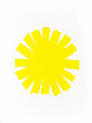
The sun as error
availability unknown, if interested please write an email
IN SEPTEMBER 2007, Charlotte Cotton, the head of the Photography Department at LACMA, commissioned me for a book. She didn’t offer any specific parameters—it could be anything.
IN SEPTEMBER 2007, Charlotte Cotton, the head of the Photography Department at LACMA, commissioned me for a book. She didn’t offer any specific parameters—it could be anything.
I approached Dexter Sinister [design collaborators David Reinfurt and Stuart Bailey] about working with me on the project. I was excited about their method of working as designers—it was expansive, not simply about the organization of language. What they do is not always so easy to define, and I was intrigued by their idea of “design as thinking,” as I have come to think of photography in similar terms. We began with simple questions: Why does this book need to exist? What format should it take? How can its format be a reflection of the ideas that compose whatever it is that we end up making? Let’s just say that very little was taken for granted.
We had some meetings and loose conversations starting two years ago. I went into the project with more ideas about what I didn’t want for the book: I didn’t want something that would simply showcase work of mine that had already had a certain amount of exposure; I wanted the book to be more of an open-ended reading of the work. Monographs are great, but I didn’t want something that straightforward.
We met in July of last year and sat around a Los Angeles studio for five days. We bought a roll of fax paper and brought books to the studio that we thought were related to previous conversations we had had over the course of the year, and we just began reading and talking, cutting things out, making photocopies, and taping materials onto the paper—assembling a scroll from the various source materials. Out of this came something like the “guts” of the book. At the end of the day, we would go through the scroll trying to articulate the reasons we had selected certain images, passages, quotes, and diagrams. To my surprise, I ended up with a renewed faith in the images themselves and eventually did away with all the clipped language. My hope was that the ideas that had initially compelled us were embedded in the images—it was just a matter of finding a way to present the material so it would reflect these ideas.
Later that summer, in August, while looking around the photo section of Powell’s Bookstore in Portland, Oregon, I found these amazing practical-photography textbooks that directly related to diagrams I had selected from Ansel Adams’s books and placed on the scroll back in July. Also, Stuart had shown me this beautiful old style manual that got me thinking further about the systems we use for organizing and understanding the arrangement of language and photographic imagery. So by the time I hit Powell’s, although the idea was still vague, I was very curious about looking through these old books with illustrational diagrams and how they might function within a system of hieroglyphics. The book includes a number of these diagrams juxtaposed with my own photographic work. (I didn’t make any new work expressly for the book.) And once I got back to Los Angeles, I would spend hours roaming the various libraries at USC looking through books for diagrams on optics, handwriting analysis, Indian sign language, hypergraphics, optical illusions, and cartography, not to mention all of the diagrams that did not survive the rather rigorous editing process!
I guess the last thing I’ll say here is a bit about the persistent use of the asterisk. It is one of several recurring motifs in the book, but it is probably the most prominent. The origin of this particular asterisk is from an essay by David called “This Stands as a Sketch for the Future,” which he produced as part of a one-year project as a research affiliate at MIT’s Center for Advanced Visual Studies. The essay traces the legacy of the graphic designer Muriel Cooper. Cooper was the first design director of the MIT Press, and she is the person who designed the brilliant MIT Press logo and the Bauhaus book, among other things, of course. She was also a visionary educator, and while at MIT she cofounded the Visible Language Workshop in 1975, which was a teaching and production facility in the School of Architecture. Within David’s essay there is a reproduction of a poster for an MIT fellow’s traveling exhibition, and the asterisk is the graphic symbol that is featured in the poster’s design. You could easily say that I have become obsessed with this graphic symbol, not only because of the beauty of its form but also because it is the symbol for elsewhere. It literally redirects you, and as a reader it continually repositions or reorients you. You could say that Muriel Cooper is the patron saint of this book.